Redesigning DG
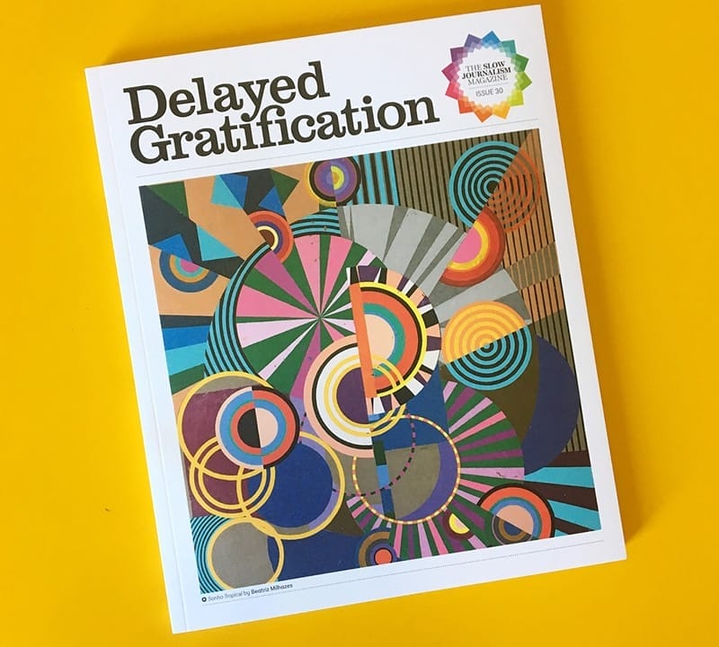
Those of you who have been reading Delayed Gratification for a while may notice some big differences in the new issue, DG#30, which sees us unveil our biggest redesign since we launched back in 2011. Here’s how we made Delayed Gratification mark II…
We have an annual redesign conversation at the Slow Journalism Company, in the run-up to the issue covering the first quarter of the year. It goes something like this:
DG team member 1: ‘Let’s have a proper redesign of Delayed Gratification!’
DG team member 2: ‘Agreed, we can totally rethink everything.’
DG team member 3: ‘I’m so into this! Let’s have a redesign meeting – with biscuits!’
DG team member 4: ‘It’s just going to be so nice to mix things up, isn’t it, we can really get a fresh perspective on the magazine.’
DG team member 1: ‘Okay, great. So shall we change magazine component A?’
DG team member 2: ‘No, not A, I love A, let’s leave A in.’
DG team member 1: ‘Fair enough, shall we change B?’
DG team member 3: ‘Awww, but I really like B! Let’s leave B as it is.’
DG team member 2: ‘Yeah, we’ve gotta keep B!’
20 minutes later…
DG team member 4 (aggressively waving biscuit): ‘Y? You want to change Y? What, are you crazy? You will rip out the heart of this magazine!’
DG team member 3 (tearfully): ‘Z? Will we give Z a tweak? A little one?’
DG team member 2: ‘YOU CANNOT CHANGE Z! If we change Z we might as well just stop commissioning in-depth reportage and just print a load of jolly cat pictures each issue instead. Is that what you want? Delayed Catification?’
This has been the pattern of our redesign chats in recent years. The editorial and design team of DG is a well-meaning and mild-mannered group, but the magazine is our papery baby and the thought of changing it brings us out in a cold sweat.
But something different happened this year. In mid February, our art director Christian came to the team with a series of four bold redesign proposals:
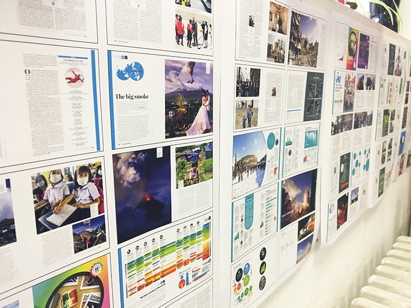
Firstly, we could move the News in Brief write-ups (Nibs), which have always run down the sides of features, into a super new section at the start of each month.
Secondly, we could expand the Almanacs sections into new combined sections with Nibs (working title ‘Almanibs’), allowing us to include lots more infographics, including new micro-sized ones (working title ‘Microfographics’), and give readers an overview of the whole month in one place.
Thirdly, removing the Nibs would free up lots of space in the features for maps, illustrations, information boxes and the occasional double-page spread photo and make the magazine feel more spacious and easier to read.
And finally, we could then introduce page numbers to make it simpler for readers to navigate the magazine.
Christian’s suggestion produced quite the sensation. It was like the scene inside Wittenberg Castle Church in October 1517 when Martin Luther started lustily nailing his 95 theses to the door. Or when Bake Off moved to Channel 4. There was confusion, incredulity – even a little low-level uproar. Had the announcement taken place during Victorian times, someone would almost certainly have started passing around the smelling salts.
Oddly enough, one of the most controversial of Christian’s suggestions was the introduction of page numbers. It’s fair to say that these are a fairly well-established device throughout much of the publishing industry, but when Delayed Gratification was launched back in January 2011 we decided we didn’t need them as with our running Nibs columns we already had dates as a way-finding tag that made specific page numbering redundant.
For the next month, the team gathered to discuss Christian’s suggestions in hushed tones, like frightened rabbits tentatively nibbling a carrot they suspect to be a grenade. We talked through the implications of moving Nibs and inserting page numbers, and gradually started to get excited about the editorial benefits.
Then Christian made a draft design of the new Almanibs section – at which point we really began to see the light. And when we did all eventually get fully on board with the new plan, we went on something of a redesign rampage, coming up with new tweaks, twiddles and wholesale reworks with the zeal of the newly converted. In short order we decided to go ahead with…
· A new Slow Journalism Company logo surrounded by a pattern made of 12 colours representing the 12 months of the year. This pattern will rotate a quarter turn each issue so the relevant colours for that issue are at the top.
![]()
· A refined Delayed Gratification logo including a much-requested ligature tweak (true design fans can geek out on the full story here)
· A new sans serif font called Basic Narrow Sans. It’s a clearer and more characterful sans serif which gives us a greater flexibility in weight. It also better complements our main features font, the classic scotch roman newsroom typeface, Miller.
· A new ‘In this issue’ contents section, which keeps the ranking of features from long to short and serious to frivolous, but also highlights some of our best stories and allows readers to see the features in chronological order.
· A new, cleaner and more beautiful back cover. This was something we agonised over, and a couple of team members fought a rearguard action to keep the existing nest of quotes. But once we saw the new design we were sold: it’s a calmer, less frenetic page and we can still feature our favourite quotes in the new contents section.
· A new, harder-wearing but softer-feeling paper stock on the cover, so that copies are less likely to get scuffed.
Getting the magazine ready for press was exciting, it felt like the run-up to issue one back in winter of 2010, when everything was new and up for grabs. And getting the first copies of DG#30 back from the press was a particularly pleasing moment. It feels like a big step forward.
We’re eager to hear what you think of the new look. We hope you like it, but it may be that you don’t notice a great difference. Or it may be that you do and you don’t approve. Redesigns are funny things and it can take a while to process them. But either way, once you’ve got to grips with the new issue we’d love to hear your thoughts – drop us a line at theeditors@slow-journalism.com.
In the meantime, Vive la revolution! And Vivent les page numbers!
If you’re interested in more insights from Christian, why not register your interest here for a free design-focused DG newsletter
Slow Journalism in your inbox, plus infographics, offers and more: sign up for the free DG newsletter. Sign me up
Thanks for signing up.