Vowel movements

The next issue of Delayed Gratification, to be published in June, represents a milestone for us. It’s our 30th issue, and to mark the occasion we’re treating the magazine to a bit of a makeover. We’re keeping some exciting changes under wraps for the time being, but we can now exclusively reveal our new masthead (above)! Whaddaya mean it looks exactly like the old one? OK, so it’s only a small change, but aficionados of serifs and ligatures might appreciate the cosmetic tweaks applied by our art director Christian Tate. We spoke to Christian about how the DG masthead has evolved over the past seven and a half years.
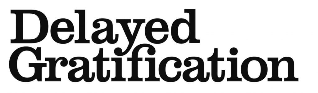
Version 1
“I inherited the original masthead (below) when I joined the Slow Journalism Company shortly before we published our first issue. I wanted to take this text and make it a little more distinctive, more like a logo. On the original masthead there was no dot on the first “i” because the “y” was in the way, and I saw the opportunity to use the dot at the bottom of the “y” to create a ligature. I also thought that the “f” looked awkward next to the dot of the second “i” and I saw there was a chance to join those up as well.”
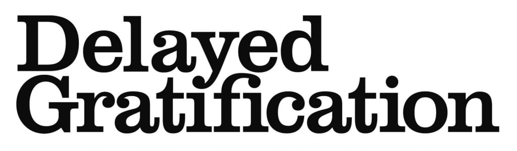
Version 2
“We used this masthead (below) for the first 29 issues of Delayed Gratification. It became smaller from issue 18 onwards although the design didn’t change. But I’ve never been very happy with the top of the “f”. It always looked a little stretched and awkward to me, and when I saw some people on Twitter having a conversation about the ascender of the letter it seemed like the right time to set myself a challenge and improve the design.”
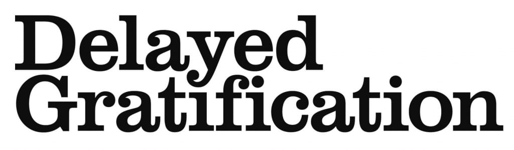
Version 3
“This is our newly tweaked masthead (below). I’ve tried to make it all more balanced and to give the “f” a nicer curve on the top as well as a more pleasing shape. Most people won’t notice the difference, but I’m glad we’ve now got a letter “f” I’m happy with!”
If you enjoyed this piece, why not head here to read more about the redesign of issue 30
And head here to find out about the latest and greatest redesign, of issue 46
If you’re interested in more insights from Christian, why not register your interest here for a free design-focused DG newsletter
Slow Journalism in your inbox, plus infographics, offers and more: sign up for the free DG newsletter. Sign me up
Thanks for signing up.