Infographic: The best and worst countries in the world 2016
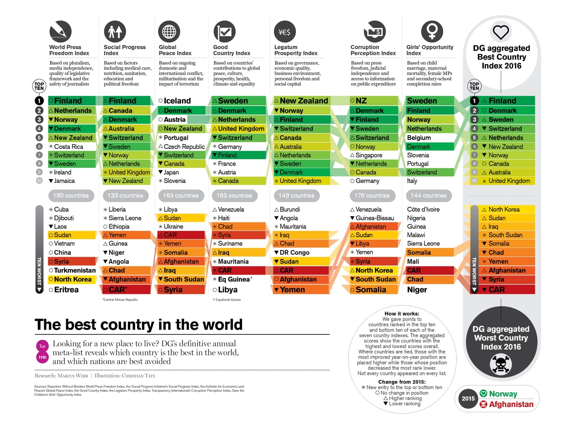
Every year we painstakingly peruse the various ‘best country’ indices that are annually compiled by NGOs and international development bodies – then we crunch the numbers across all the different categories to come up with this infographic: a definitive ranking of the best and worst places in the world to live.
Hover over the infographic below to discover which nations are currently feeling on top of the world, and which rank lowest for freedom, gender equality, peace and quality of life. And to see which places are the climbers and which are the sliders, you can compare this year’s list with our aggregated rankings from 2015 and from 2014.
This infographic was published in DG#25. Pick up a copy in our online shop or take out an annual subscription with promotion code ‘SLOWPOST’ and you’ll get our current issue for free.